I start from the beginning. I will summarize, delete all unnecessary and try to outline the path.
What did I learn during the course?
I experimented with cement, plaster, clay, found objects and other materials. It is also self-evident to me that to understand the material, it is not enough to make something out of it just once. The material should open up to the master, make itself felt. Only in this state, highly effective interaction can occur between the material and the artist.
Also, this was one of the most sensual courses for me. I was able to see not with my brain, but with my body. This correlated with what my psychologist said. I control a lot with my mind and do not listen to my inner self. Most amazingly, I knew which work was successful and which was a failure, but I did not pay due attention to it.

Another important aspect that I understood is the involvement of the material in the expressed idea. Jerry Saltz, in his book “How to be an artist”, talks about embody into the material. I understood this on the example of work 5 in project 8. Because, the declared theme - the third digital photo that the viewer sees on his computer or phone - is not related to physical work. Thus, the materials used do not contain the artist's idea of a digital presentation.

But in work 5 in project 5 Natural screen, the materials used fully support the idea and reveal it even more than the artist's notion was.


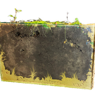

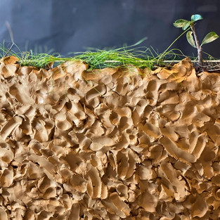
Or, for example, in work 1 project 8. The use of plaster made it possible to create ant channels inside this material, and a flat surface on one side helped the perception of the video. Thus, both the chosen form and material turned out to be correct, endowed with a part of the idea.

In parallel with the practice of sculpture, I continued to work with paintings. Parallel work on painting and sculpture, motivated me to explore the line between plane and volume.
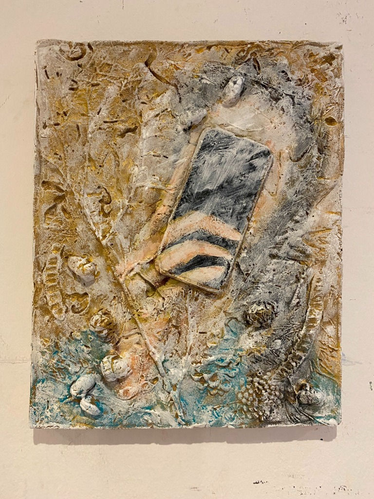
Here the most intriguing thing for me was and still is that, for example, a relief and a painting with a large volume of paint on canvas are very similar. Or, for instance, as in work with relief and the telephone - these are two mediums together. By and large, through the piece "One and Three" one can understand that the painted surface itself is the same object as a sculpture. At that point preferably, the artist must think about how justified the use of a plane surface or three-dimensional medium in a given situation.
Another significant aspect, the flatness allows the colour to unfold. And the viewer can concentrate only on the colour. While in the volume (for example, in nature) the beauty of colour is always a combination of elements. Thus, the viewer at first will have to separate the colour from the objects.
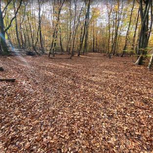
Examples of my photos, where the shape interferes with the purity of the colour.


Colour, Shape and Material
Project 1; Project 3 Work 3 Abstract form; Project 7 Bas-relief Work 3


Colour on plastic or ultraviolet colour, as well as the flashy green colour of special effects – these, are all uncomfortable colours for me. They are not natural, rather industrial. It seems to me that they are so bright because they hide something, or, there is nothing under this bright colour.
During this course, I experimented with different materials and concluded that I was missing colour in sculpture. In painting, I work only with colours, but here, the paint I might need only at the end of the entire process of creating a sculpture.
How can I inject colour into a sculpture to work with colour?
Colour (Commonwealth English), is the characteristic of visual perception described through colour categories, with names such as red, orange, yellow, green, blue, or purple. This perception of colour derives from the stimulation of photoreceptor cells (in particular cone cells in the human eye and other vertebrate eyes) by electromagnetic radiation (in the visible spectrum in the case of humans). At: https://en.wikipedia.org/wiki/Color


Colour is sensation, perception. If we imagine the colour of a garden on a plane, then we can generalize the shape, and even bring it into a sculpture with the same forms. But what material and form should it be? Which medium will represent it in the best way?
Representative and abstract. In this regard, it seems to me that when a person can recognize an object, he automatically begins to think with his head. In abstraction, there is a potential that the brain will give a chance to the sensations to evaluate first.
Material. Before this course, I worked on synthetic boards, wood, paper, canvas without thinking about the material itself. Of course, I understood that wood would react this way to water, paper differently. But by and large, canvas, for example, was just a popular material for holding up paint. When this material covered with paint, then it does not interfere and does not has a role. But after working with the reliefs, I saw that the material becomes part of the shape depicted on it.

I tried to transfer this idea to my work. In painting - it turns out that the canvas does not fully participate in the concept.
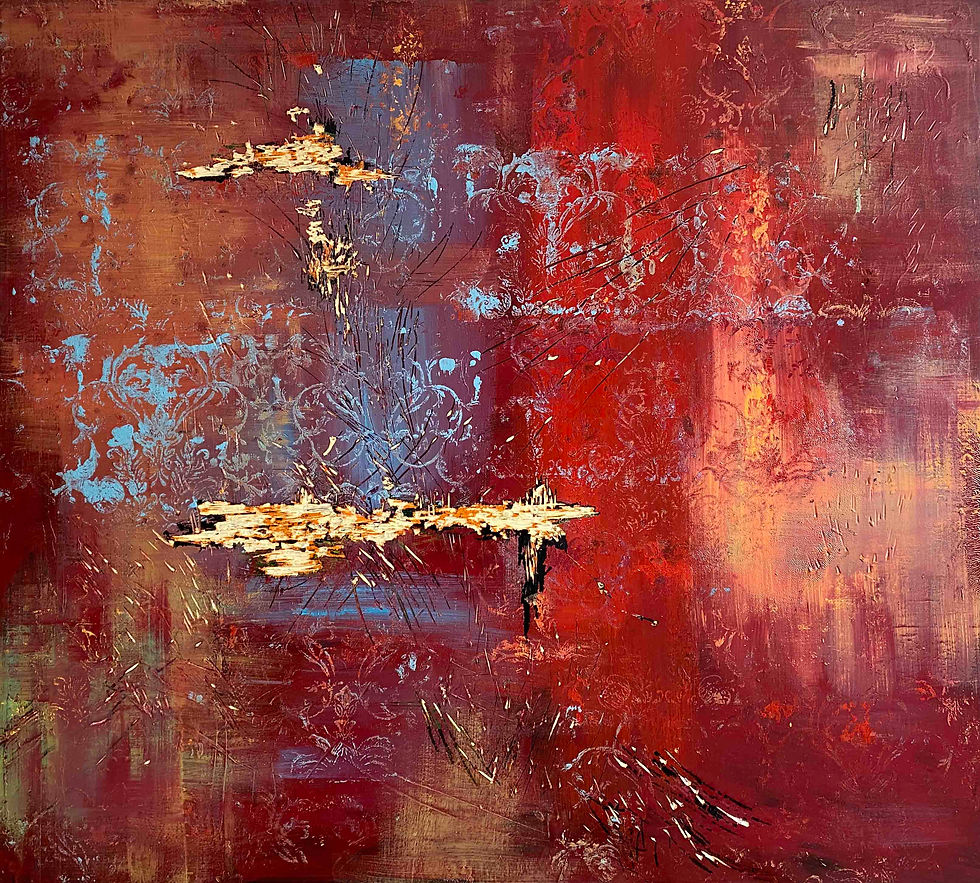

Then I dropped everything unnecessary, focused on the depth of colour, added delicacy with the help of monotype (floral ornament) and "opened the material". I used engraving tools and removed several layers of paint and wood.

At that moment, I felt that something seemed to open, a breakthrough. The wood became part of the drawing.

It reminded me of Russian icons when the paint falls off, and only a wooden base remains.

Andrey Rublev - Christ the Almighty, icon/painting, Beginning of the 15th century, tempera on wood, Height: 158.0 cm; Width: 106.0 cm At: https://ru.wikipedia.org/wiki/Файл:Andrey_Rublev_-_Христос_Вседержитель_-_Google_Art_Project.jpg (Accessed 29.09.2020)
What interests me?
Sensations. The senses. Tactile sensations. Texture. Rich colour.
During the lockdown in 2020, it is evident that people more and more see the world through the screen of the TV or laptop/Smartphone. Online exhibitions, performances and other events happen behind the screen. So it is flat what we see, it is an interesting point.
What was successful in my previous experience?
About some successful works, I already mentioned above.
But I can find something similar in between them:
- as a rule, a set of materials,
- technically performed in a not always understandable way for the viewer or with high professionalism,
- the material is directly involved in the declared topic,
- these works prompt the discussion and do not state anything.
Bibliography and references
1. Saltz J. (2020) How to be an artist. Riverhead Books
Comments