Project 8 Casting, internal space, external form. Work 5 Three and one
- Marina WitteMann
- Oct 14, 2020
- 4 min read
Updated: Jan 13, 2021

Painting size 70x50 cm. Presentation board 40x40x100 cm. plaster, wood, stone, metal rod, painting (oil, acrylic on canvas board)

I think this is a successful art piece. And I will try to formulate why is that?
Firstly, this work represents important qualities for me. It is simple, playful, bright, and must be perceived on a sensual level.
Secondly, it was again an attempt to feel and understand the difference between sculpture and painting.
Thirdly, this work developed gradually, step by step. And the idea was born in the process of work and was not imposed.

First, there was the process of building the composition. The colour was a motivating factor for me. As you may have already noticed, I am passionate about this turquoise colour. For me, it is a complex, modern and dynamic. The colour is of sophistication and uniqueness. I took it as a basis and then correlated the colour and objects. For example, a round pyramid with pimples could not be green or black, it could only be orange like soft textile because this piece of plaster had such a delicate surface. And the plaster relief with expressionist stains and round recesses for me was like the sky with comets and stars.
Next, to break the boredom of the optically similar objects, I added the rhythm - a metal rod. Also, as the rod stands out of the violet plaster relief, it will combine two sides of the composition. Such a combination of objects looked like a graph from the PowerPoint presentations. I thought I could try to develop this topic further - transfer graphics from my previous jobs to sculpture. After all, this is an interpretation of the facts of life (number of sold cars or taken loans from the bank) that exists only in a flat form (digital or on a paper). These are graphs, tables, pivot tables and charts that are perceived by all office workers in the world. It is like a unique sign language.
Furthermore, after adding the dynamic metal rod, there was a feeling of deficiency of a turquoise colour. Something in the nature of the dominant and the key-point of the story disappeared. Thence I brought in an even colour with a calm surface – wooden tablet.
Moreover, when I remembered that this is a sculpture and must be walked around from all sides, it turned out that the reverse side is empty and obscures the entire composition. In contrast to the reverse side, the flat side of the relief has become monochrome.
Not to mention my favourite element - an egg-shaped object. It is not a circle or an oval; it is not a drop or an egg; this is not a pyramid or a roly-poly toy. The white colour unites the white surface of the stand and introduces it into the relief plane.
After that, I started to paint. Here I lost myself. It is difficult to say anything about my feelings, I was a process, and I was not present. I felt the colour I was it. I copied what I see when interpreting the colour. Then this process ended. The world has returned to its dull and lifeless state.
What do I see now in front of me? There is an original and a copy. No! Actually, there are two real compositions and one digital. The first is the original, which is in my house. The second is a painting with the same objects, which is also in my home. And what you see on your screen is a photograph with the original and the painted work in total three. Can I call it “three and one”? Three elements would match with colourful objects on one side and one on the other of the relief, and stimulate the viewer to search the digital version.
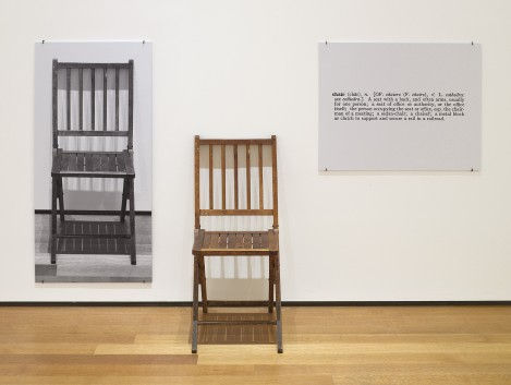
With this in mind, I was thinking about One and Three Chairs, Joseph Kosuth. The artist presented chair, photo of this chair and a dictionary entry for the “chair”. Thus he opposed the question of what actually chair is? And what representation of it can be?

One and Three Chairs, Joseph Kosuth, 1965. Wood folding chair, mounted photograph of a chair, and mounted photographic enlargement of the dictionary definition of "chair", Chair 32 3/8 x 14 7/8 x 20 7/8" (82 x 37.8 x 53 cm), photographic panel 36 x 24 1/8" (91.5 x 61.1 cm), text panel 24 x 30" (61 x 76.2 cm) At: https://www.moma.org/learn/moma_learning/joseph-kosuth-one-and-three-chairs-1965/ (Accessed 13.01.2021)
My work is a try to state one more potential representation – digital.
I imagine that the first composition and painting are presented, for example, in a gallery, as well as in a digital space. Once a photo is uploaded to the Internet, then it goes into this "other space".
Therefore, in this work, it is probably correct to add one inscription. Like this:

The viewer sees in the gallery: 1. The first image is the original, which is contains real objects. 2. The second image is a painting with the same objects. 3. And on his screen is a photograph with the original and the painted work.
“Three and One” this is about the original, copy and representation of it. It is an awareness of the ways of seeing. In real composition, some objects can be hidden behind the big violet plate depends on the viewer position. In a painting, the artist decides what to paint and what to hide, and at the same time, it is also an independent object. Regarding the image in digital apace, we need to be aware that it is something third which contains the first two and does not have a physical body. Or this body transfers into the body of your laptop or smartphone.


Commentaires